Choose a look
Styles, the three directions, matching a design you like, and designing with your brand.
Updated 5 November 2026
You can leave the look entirely to Tappy, or steer it in four ways. All of them sit in the row under the description box.
Pick a style
The first menu in the row sets a style: Auto, Editorial, Soft & friendly, Bold & playful, Calm minimal, Dark & technical or Premium. Auto chooses one that suits your app.
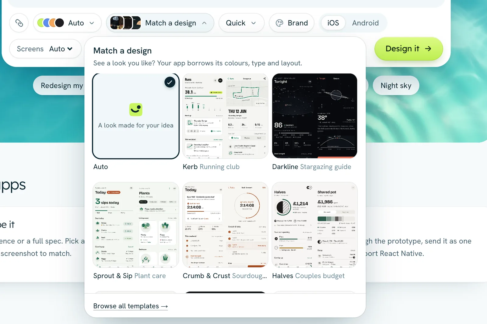
Match a design you like
Press Match a design to borrow the colours, type and layout of one of Tappy's finished apps. The button then reads Like and the app's name, and a line above it says which look you're matching. Press Remove there to go back.
Use your brand
Press Brand, paste your website's address and press Import. Tappy reads the site's colours, fonts and logo, and the app is designed with them. Imported brands are saved as brand kits, so you can reuse them. Manage them on the Brand kits page, where Design an app with it starts a new app in that brand.
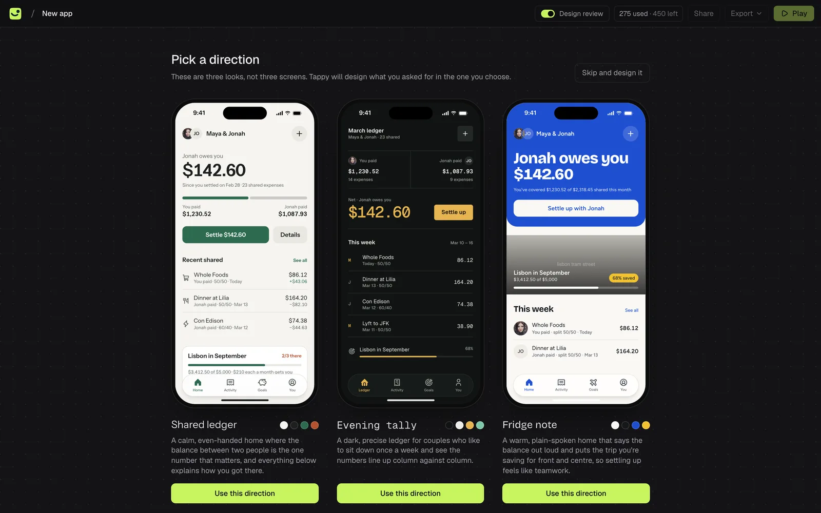
Pick from three directions
Before designing every screen, Tappy can sketch three different looks for your app, so you choose the direction first. Click the one you like or press Use this direction. It's on by default on paid plans and off on the free plan. Turn it on or off with Show three directions first in Settings.