
Compare
How Tappy compares
Plenty of tools can draw a screen. Tappy is built to take a mobile app from one sentence to a reviewed design you can tap, test and run on your phone.
Free to start. No card needed.
The whole field at a glance.
Checked 4 November 2026.
| Feature | Tappy | Sleek | Claude Design | Google Stitch | Figma Make | Uizard | Banani |
|---|---|---|---|---|---|---|---|
| Made for | Mobile apps | Mobile apps | General design | General UI | Figma prototypes | Product mockups | Web and mobile |
| Free plan | 450 credits | 60 credits | On Claude Free | Free | 500 credits a month | 3 generations a month | 12 monthly credits |
| Cheapest paid plan, billed monthly unless marked | $19/mo | $29/mo | $20/mo Claude Pro | None listed | $16/mo per seat | $12/mo, billed yearly | $20/mo |
| Clickable prototype | Yes | Preview links, from Starter | Yes | Yes | Yes | Yes | Yes |
| Figma export | Every plan | Limited on Free | Not on export list | Paste to Figma | Built in | Not listed | Paid plans |
| React Native export | Yes, Expo | Not listed | Not listed | Not listed | Not listed | Not listed | Not listed |
“Not listed” means we couldn't find it on that company's public pages, not that it can't be done. Prices are before any sale. Several of these companies charge less on yearly plans, and Tappy doesn't have yearly plans yet. Credits aren't the same unit across products.
Pick a comparison.
Features, prices and an honest verdict.
Tappy vs Sleek
Both design mobile apps from a prompt. Tappy gives you a bigger free start, a built-in design review, and a React Native project to take away.
See the comparisonTappy vs Claude Design
Claude Design is a great all-rounder for prototypes, slides and pages. Tappy does one job: taking a mobile app from an idea to something you can run on your phone.
See the comparisonTappy vs Google Stitch
Stitch is free, and great for exploring ideas. Tappy is built to finish a mobile app: reviewed screens, feedback from testers, and a React Native project.
See the comparisonTappy vs Figma Make
Figma Make is a natural fit if your team already lives in Figma. Tappy is for everyone else: describe an app and get a designed, clickable mobile app, with no design tool to learn.
See the comparisonTappy vs Uizard
Uizard is a friendly way to mock up product ideas. Tappy goes further for mobile apps, with a built-in design review, Figma layers and a React Native project.
See the comparisonTappy vs Banani
Banani is a solid way to generate designs for web and mobile. Tappy is built only for mobile apps, with Figma and React Native on every plan, including free.
See the comparisonProfessional, not vibecoded.
With a design review built in.
AI can get a screen most of the way there, then leave the mistakes a designer would catch in seconds. At Studio level and above, Tappy looks at a real screenshot of each new screen, reviews it like a design lead, and fixes what it finds. These are real catches, not mock-ups.
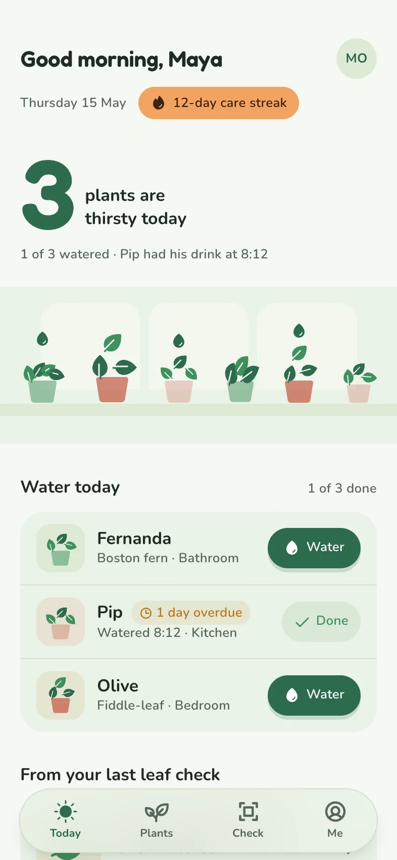
From Tappy's review of Sprout & Sip
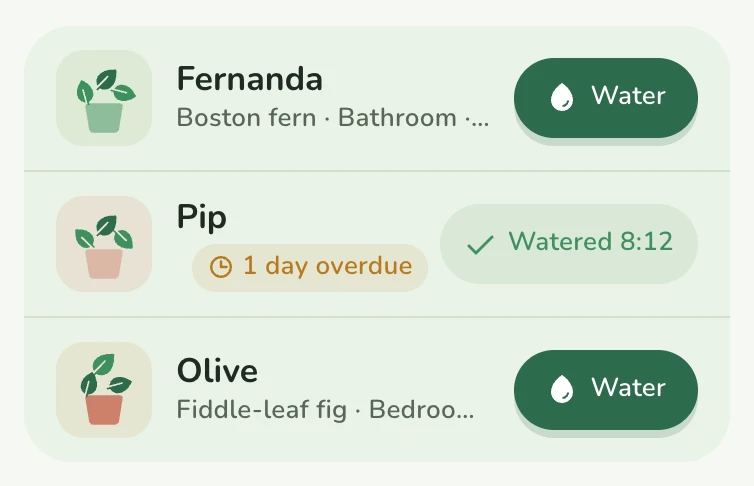
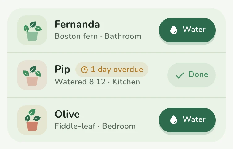
“Pip's row was broken. The ‘1 day overdue’ chip squeezed the plant name and room to nothing.”
From Tappy's review of Crumb & Crust
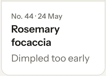
“‘Rosemary focaccia’ was cut off as ‘Rosemary foca…’ in the narrow card. Card titles now wrap to a second line instead of truncating.”

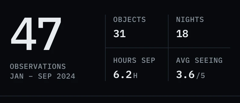
From Tappy's review of Darkline
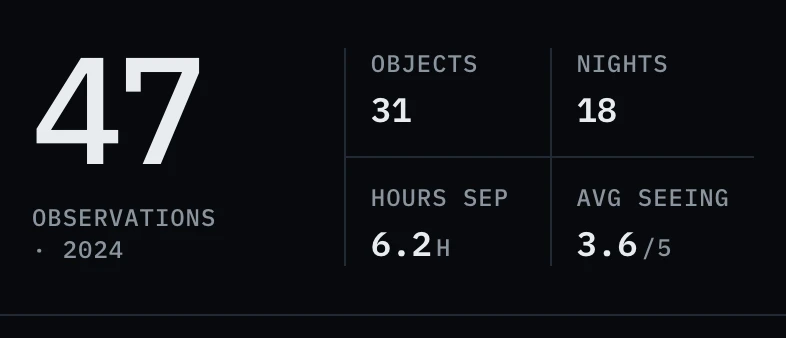
“The caption under the big ‘47’ was breaking into ‘OBSERVATIONS’ and an orphaned ‘· 2024’.”
Tappy's design rules also rule out the habits that give AI designs away:
- Gradient text
- Purple-to-blue gradients
- Neon glows
- Sparkle icons and “AI-powered” badges
- Emoji used as icons
- Decorative blobs
- Charts with no labels
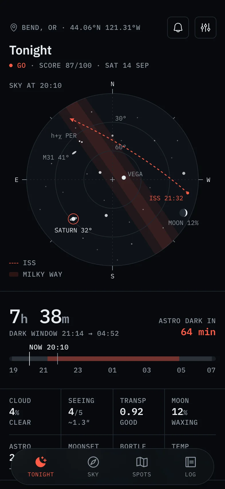
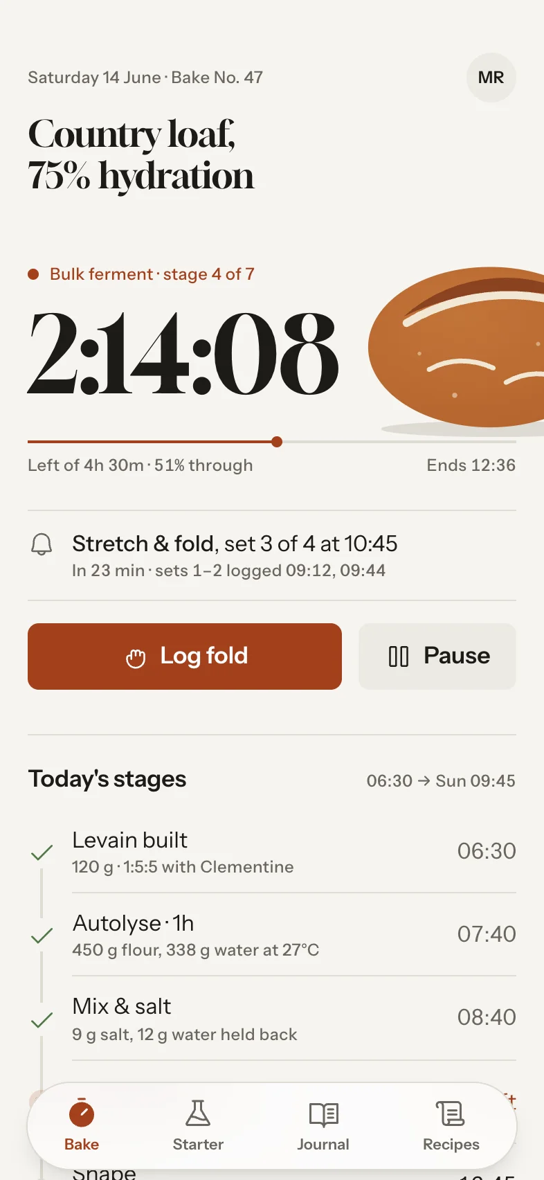
Real Tappy designs.
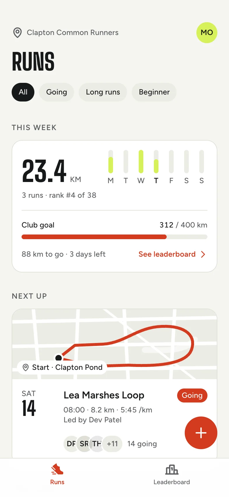
Each app gets its own type, colour and layout.




Sources, checked 4 November 2026
- Sleek pricing and FAQ
- Sleek homepage
- Get started with Claude Design
- Claude pricing
- Introducing Claude Design
- Google: Introducing vibe design with Stitch
- Google Developers: Introducing Stitch
- Netlify: Deploy your Google Stitch app
- Figma pricing
- How Figma AI credits work
- Figma Make
- Uizard pricing
- Banani pricing and FAQ
Prices and features change, so check each company's site before you decide. Product names belong to their owners, and Tappy isn't affiliated with or endorsed by them.