 Mel
Key takeaways
- 1Generic AI designs share the same habits, from purple gradients to sparkle badges.
- 2They happen because a model reaches for the most common answer when you don't give it a direction.
- 3A real art direction and real content fix most of it.
- 4The rest gets caught by reviewing a screenshot of the screen, not the code behind it.
You've seen the look. A purple-to-blue gradient behind everything, a headline in gradient text, a glowing button, a row of identical stat cards and a sparkle icon to remind you that AI was involved. It's the design version of stock music, and people spot it in a second.
Building Tappy, we spend more time on this problem than on any other. Here's what we've learned about where the generic look comes from, and how to get rid of it.
The habits that give AI designs away
- Gradient text, especially in headlines
- Purple-to-blue or rainbow gradients as a background
- Neon glows around buttons and cards
- Glassmorphism on everything, not just system bars
- Sparkle icons and “AI-powered” badges
- Emoji standing in for icons
- Decorative blobs and shapes that mean nothing
- Charts with no labels or axes
- Everything centred, so nothing leads the eye
- Round, made-up numbers like 1,000 users and 50% growth
None of these is wrong on its own. The problem is that they turn up together, by default, whatever the app is for. A stargazing guide and a budgeting app end up wearing the same outfit.
Why it happens
A model that designs from a prompt is predicting what a screen like yours usually looks like. If you don't tell it anything about the mood, the audience or what should matter most, it fills those gaps with the most common answer. And the most common answer is, by definition, the generic one.
So most of the fix isn't taste. It's giving the design something specific to be about.
Fix 1: give it an art direction
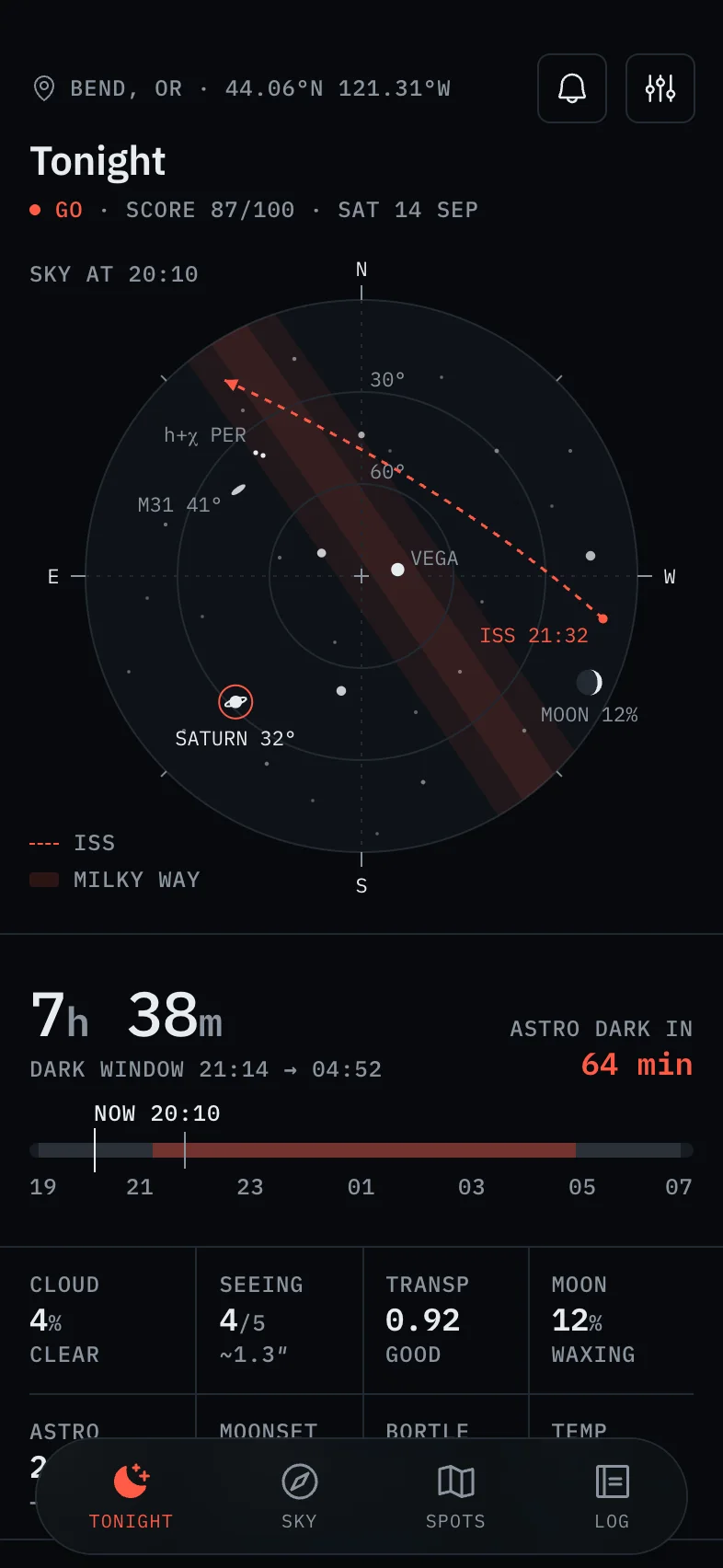
An art direction is a few sentences a designer could disagree with. It names the mood, the audience, the one thing that leads the screen and how much colour to spend. “Clean and modern” isn't one. “An instrument for stargazers working in the dark: red only for what's live, monospaced figures, nothing that ruins night vision” is.
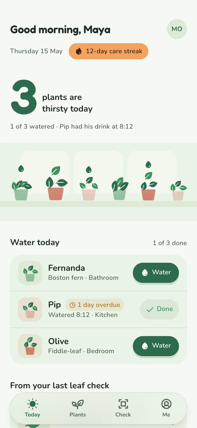
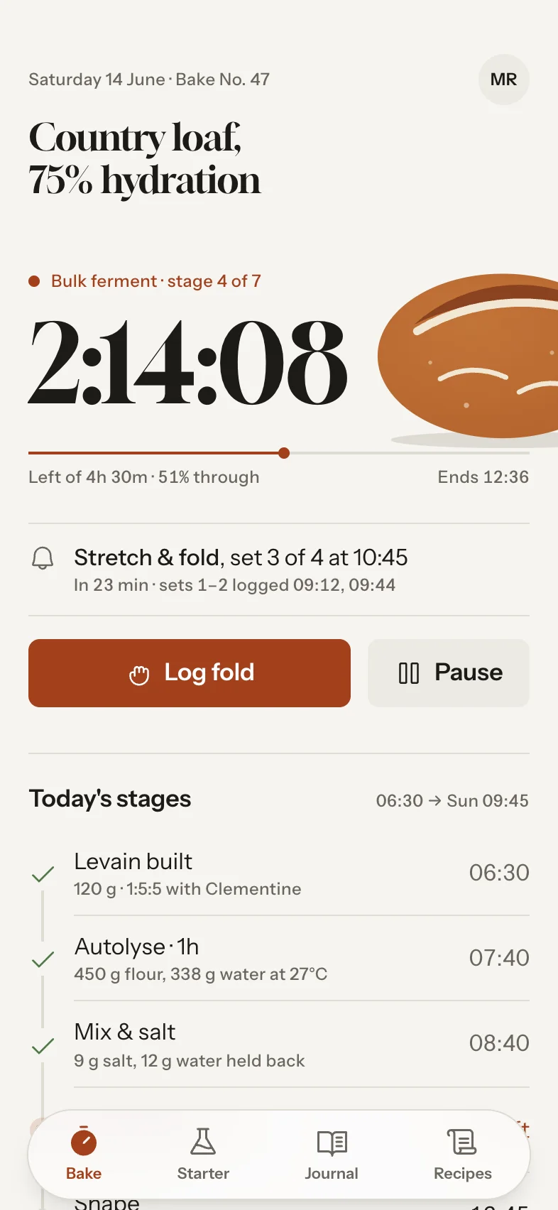
Tappy writes one for every app before it draws anything. That's why Darkline came out dark, red and monospaced while Sprout & Sip is soft, green and hand-drawn. Same tool, same week, completely different results.
Fix 2: use real content
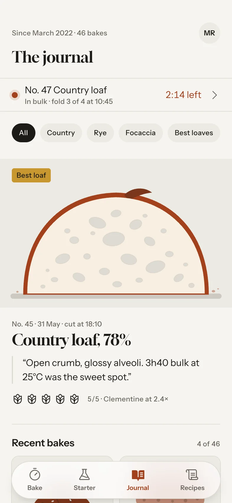
Generic screens are full of generic content: “John Doe”, “Item 1”, a chart going up and to the right. Specific content does a lot of design work for free, because it gives the layout something real to organise. “No. 47 Country loaf, 75% hydration” and a live bulk-ferment timer tell you at once what Crumb & Crust is for.
If you're writing a brief, include the details only your users would know: the units they use, the words they'd say and the numbers they'd recognise.
Fix 3: review the screenshot, not the code
Some problems only show up when a screen is drawn at the size of a real phone: a tag that squeezes a name off its row, a title cut off with an ellipsis, a label sitting on top of an illustration. None of it is visible in the code, and all of it makes a design look careless.
That's why Tappy's design review looks at a real screenshot of each new screen, at Studio level and above, and fixes what it finds. These are real catches from apps on our homepage:
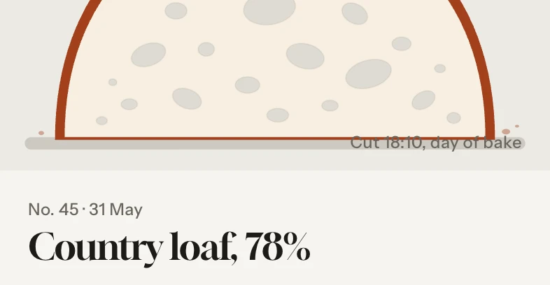
From Tappy's review of Crumb & Crust
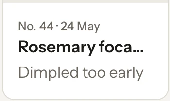
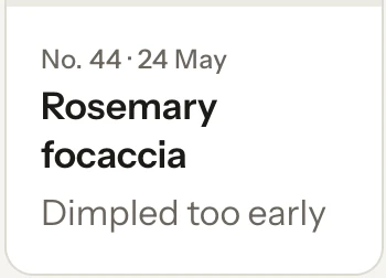
“‘Rosemary focaccia’ was cut off as ‘Rosemary foca…’ in the narrow card. Card titles now wrap to a second line instead of truncating.”
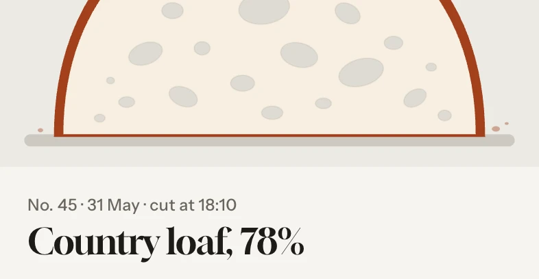
From Tappy's review of Crumb & Crust
“The ‘Cut 18:10, day of bake’ label sat on top of the drawn cutting board and crumb.”
Type a sentence. Tap your app.
Every screen designed, linked and ready to test.
Free to start. No card needed.
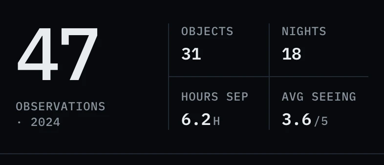
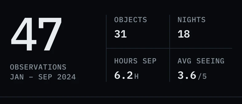
From Tappy's review of Darkline
“The caption under the big ‘47’ was breaking into ‘OBSERVATIONS’ and an orphaned ‘· 2024’.”
A checklist for any AI design
Whatever tool you use, run each screen through these before you share it:
- Does one thing clearly lead the screen?
- Is there only one saturated colour, and is it doing a job?
- Are there three or four text sizes, not eight?
- Is every name, number and date plausible for this app?
- Does any text get cut off, or wrap into a single stray word?
- Would you miss the gradients, glows and sparkles if they were gone? If not, remove them.
Want to see the difference for yourself? Describe your app in the box on this page, and compare what comes back with the last AI design you saw.