 Mel
Key takeaways
- 1Start with the one job your app does, not a list of features.
- 2Plan the three to five screens that tell that story before you design any of them.
- 3Pick one look and hold every screen to it: type, colour, corners and one tab bar.
- 4Review each screen like a design lead: overflow, alignment, contrast and tap targets.
- 5Put a clickable prototype in front of a few people before anyone writes code.
Most first apps aren't let down by the idea. They're let down by screens that don't quite fit together: a button style that changes from page to page, text that runs off the edge on smaller phones, a home screen that tries to show everything at once. You don't need a designer to avoid that. You need a method, and the discipline to stick to it.
Here's the method we built Tappy around. It works whether you design by hand, with an AI tool, or a mix of both.
Start with the job, not the features
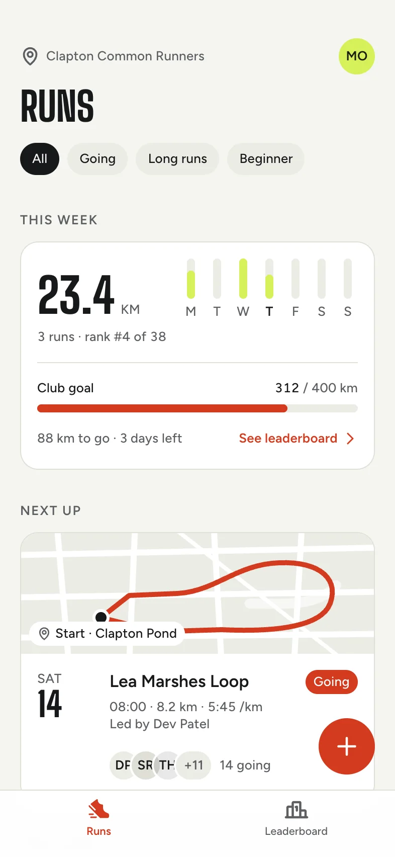
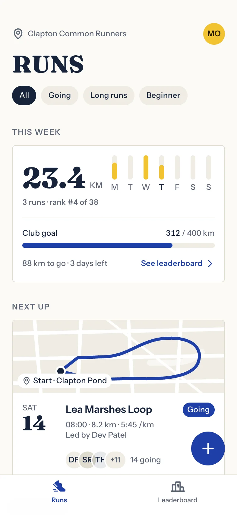
Write one sentence that says who the app is for and the one thing it helps them do. “A running club app to plan group runs and climb a weekly leaderboard with friends” is a job. “Social, maps, chat, stats and badges” is a feature list, and feature lists make cluttered screens, because nothing is allowed to matter more than anything else.
That sentence becomes the test for every decision that follows. If a screen or a button doesn't help with the job, it can wait for version two.
Plan the screens before you design them
Next, list the moments someone would screenshot to explain your app to a friend. For most apps that's three to five screens: the home they open every day, the detail behind the most important thing on it, and the place where they create or finish something.
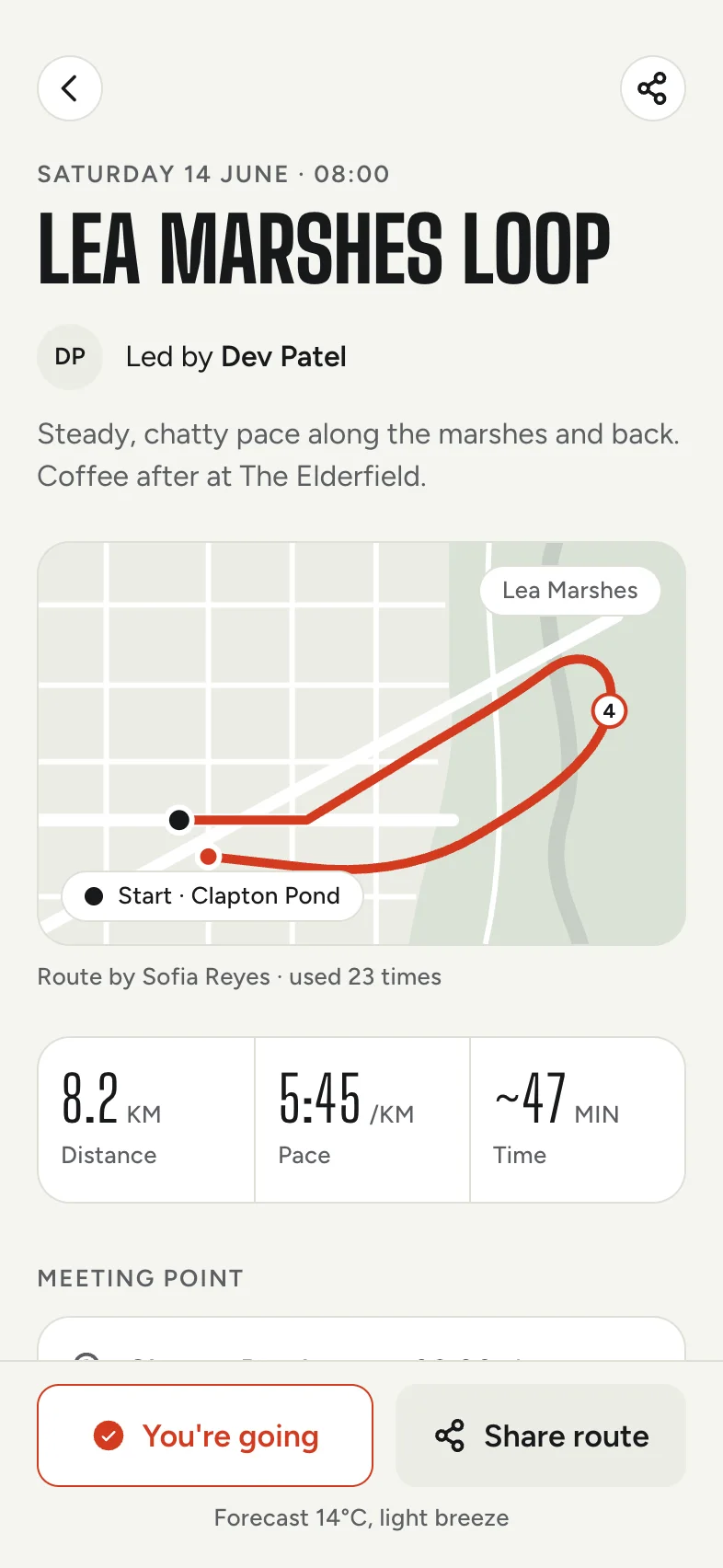
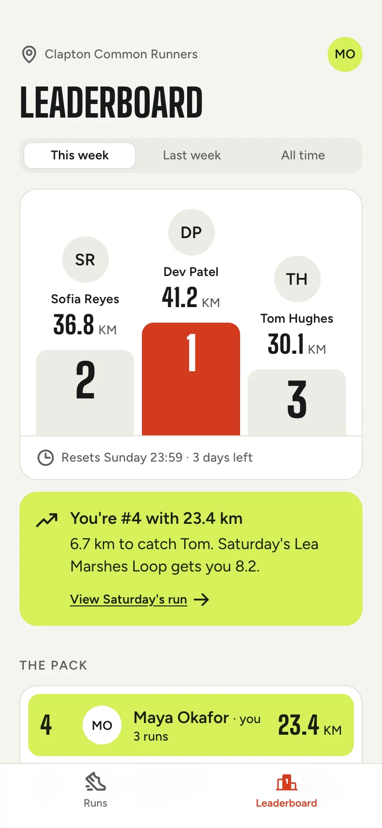
For the running club above, that came out as three screens: the week's runs, a single run with its route and who's going, and the weekly leaderboard. Everything else, like settings and profiles, can borrow the same patterns later.

Choose one look and stick to it
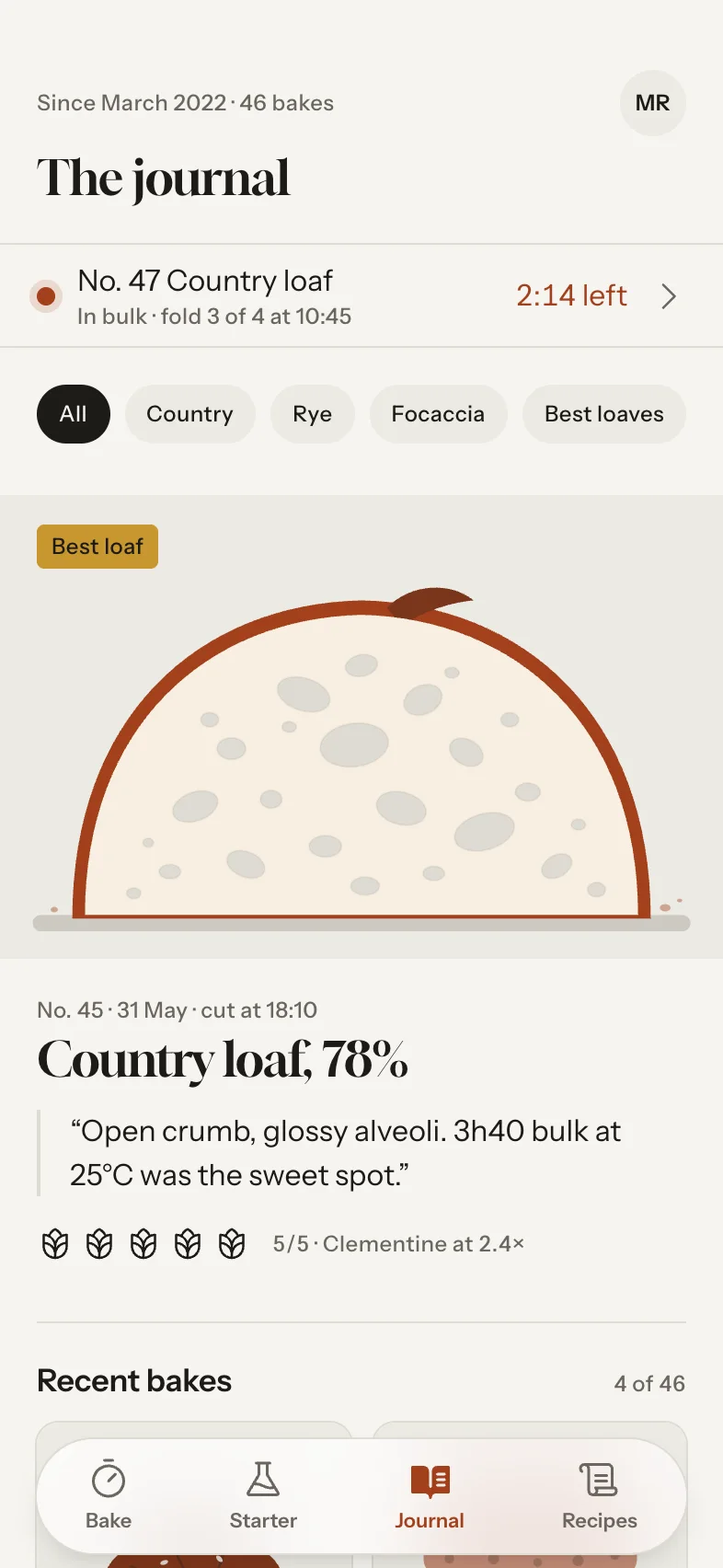
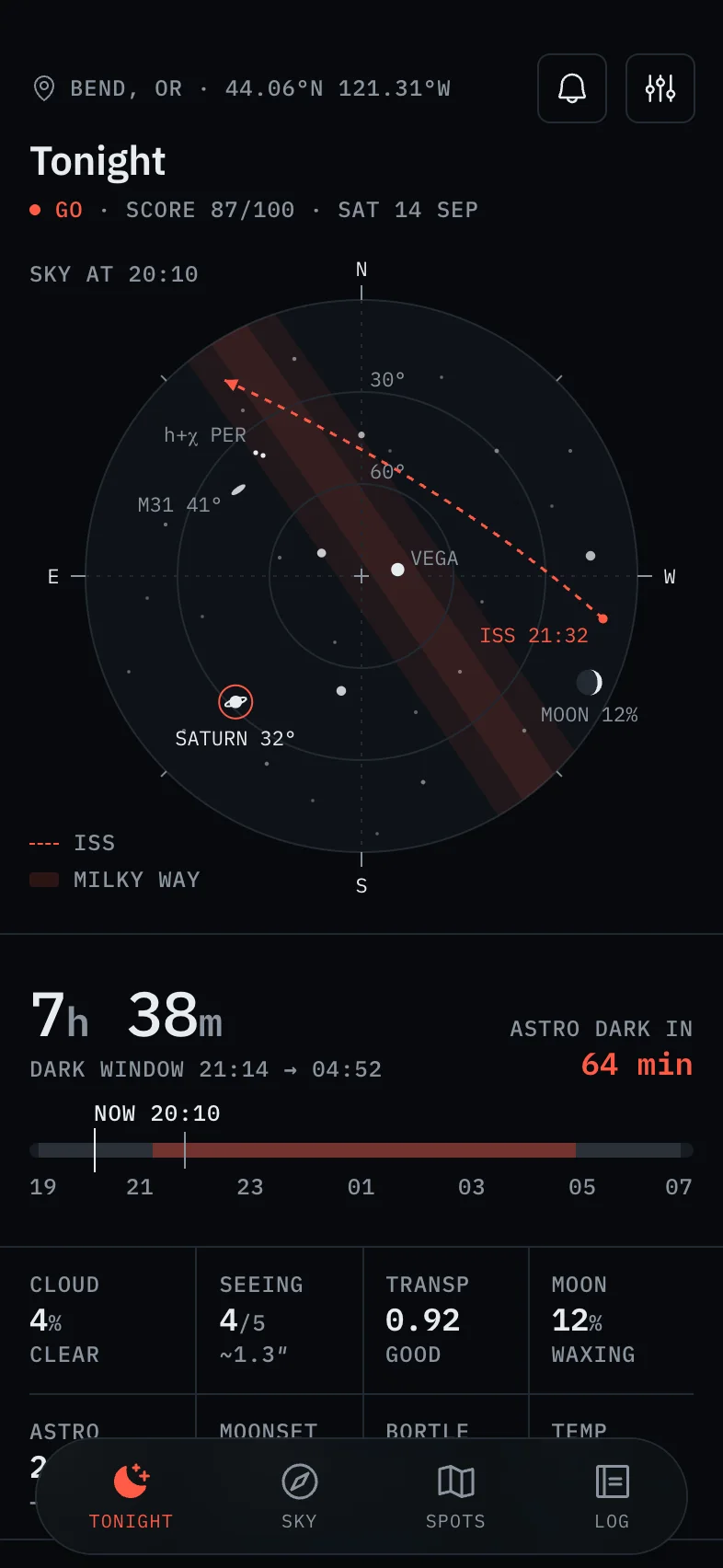
Apps feel designed when every screen obviously belongs to the same family. That comes from a few decisions you make once and then reuse everywhere:
- Type: one display face for headlines and one text face, used at three or four sizes.
- Colour: one strong colour for the main action and the current state, with calm neutrals everywhere else.
- Shape: the same corner radius on every card and every button.
- Spacing: one edge margin, and gaps on a 4-point grid.
- Navigation: one tab bar, the same on every screen that shows it.
Designers call this a design system. Yours can fit on an index card. In Tappy it's a set of design tokens, so changing a colour or a font updates every screen at once, and trying a new look costs nothing.

Design each screen, then review it
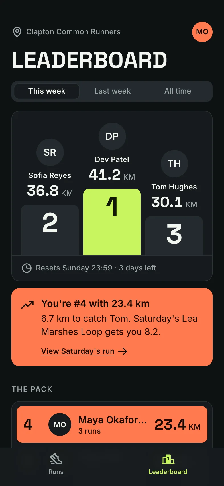
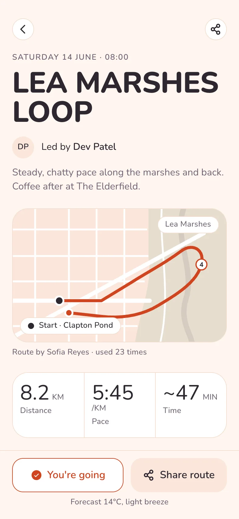
Once a screen exists, look at it the way a design lead would before it ships: not at the code or the design file, but at the screen itself, at the size of a real phone. These checks catch most problems:
- Rendering: nothing cut off, nothing spilling past the edge, no text wrapping into a lonely last word.
- Hero: one thing clearly matters most, and there's one main action.
- Boxes: if more than two cards are fighting for attention at the top, take some of the boxes away.
- Content: real names, numbers and dates, not placeholders.
- Colour and contrast: one saturated colour, and text you can read in sunlight.
- Touch: every button and link at least 44 points tall, so thumbs don't miss.
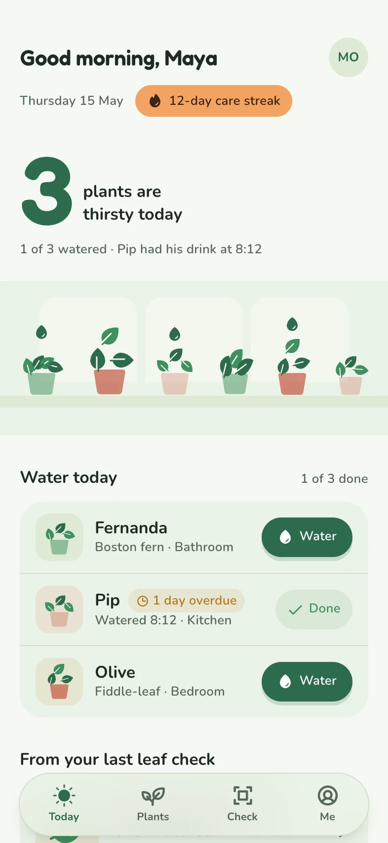
At Tappy's default Studio level, every new screen gets this review from a real screenshot, and Tappy fixes what it finds. Here's one of its catches:
From Tappy's review of Sprout & Sip
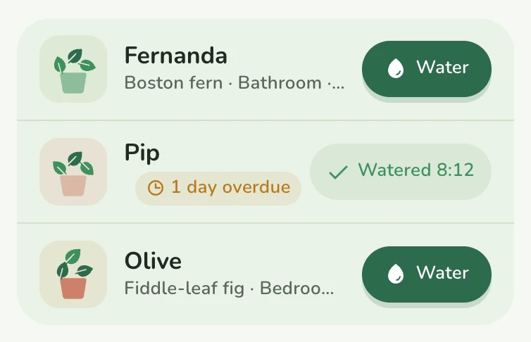
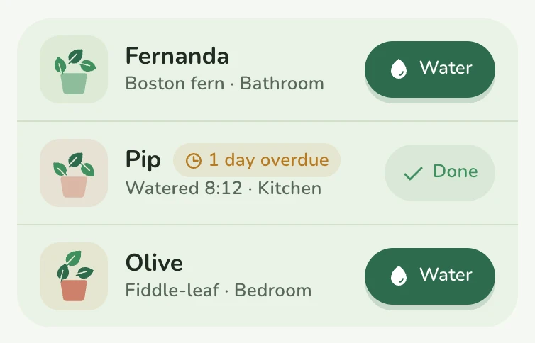
“Pip's row was broken. The ‘1 day overdue’ chip squeezed the plant name and room to nothing.”
Test it before you build it
A clickable prototype is your screens linked together, so taps go where they would in the real app. It's the cheapest way to find out whether people understand what you've made. Watch a handful of people try to do the app's main job without helping them. Five is a common rule of thumb, because by then the same problems keep coming back.
There's more on this in how to test your app idea with a clickable prototype.

Type a sentence. Tap your app.
Every screen designed, linked and ready to test.
Free to start. No card needed.
Hand it off without losing the design
When the design holds up, take it with you. In Tappy you can paste every screen into Figma as editable layers, send the prototype as one HTML file, or export an Expo project in React Native that runs on your phone. Each one keeps the type, colour and spacing you settled on.
The short version
Decide the job. Plan a few screens. Pick one look. Review every screen like a design lead. Test before you build. To try the whole loop in one place, describe your app in the box on this page. You get 450 free credits to start, and no card is needed.