 Mel
Key takeaways
- 1Say who the app is for and the one job it does.
- 2Name the moments that matter, not every feature.
- 3Describe how it should feel, and leave the exact colours to the designer.
- 4Add constraints only when you mean them, like “no photos”.
An AI designer can only be as specific as the brief you give it. Hand it “a fitness app” and you'll get the average fitness app. Hand it two careful sentences and you'll get something that looks like it was made for your users.
A good brief is short. It just has the right things in it.
What a brief needs
- Who it's for. “Home bakers who bake every weekend” beats “bakers”.
- The one job. What does someone open the app to do?
- The moments that matter. Two or three things the app must do well, in plain words.
- The feel. A mood or a comparison, like “a well-kept notebook” or “an instrument you'd use in the dark”.
- Real constraints. Your platform, brand colours you must use, or rules like “no photos”.
Notice what isn't on the list: hex codes, font names and a page-by-page spec. If you have a brand, those matter, and in Tappy you can bring them in from your website as a brand kit. If you don't, leave them out. Picking type and colour is the designer's job, and you'll get a better result by describing the feeling you want.
Three real briefs, and what they made
These are the exact briefs behind the example apps on our homepage, including the rule we added to every one: draw images instead of using stock photos. Tappy designed each one, and we didn't edit the results.
Darkline, a stargazing guide
A stargazing guide that shows what's visible tonight, the best dark-sky spots nearby, and an observation log. Draw every image with shapes and icons: no photos, and initials instead of faces.

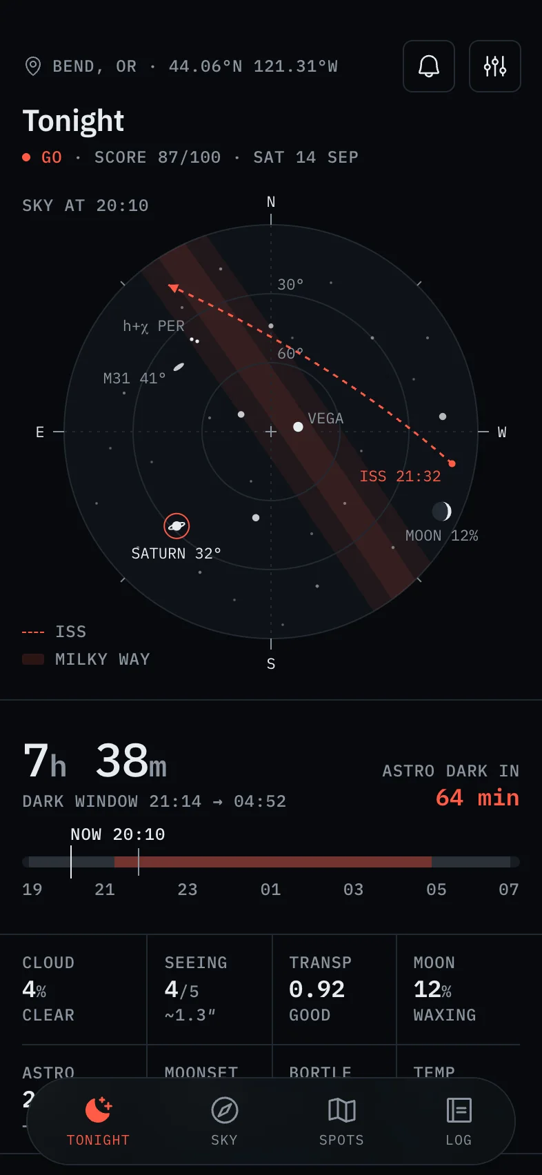
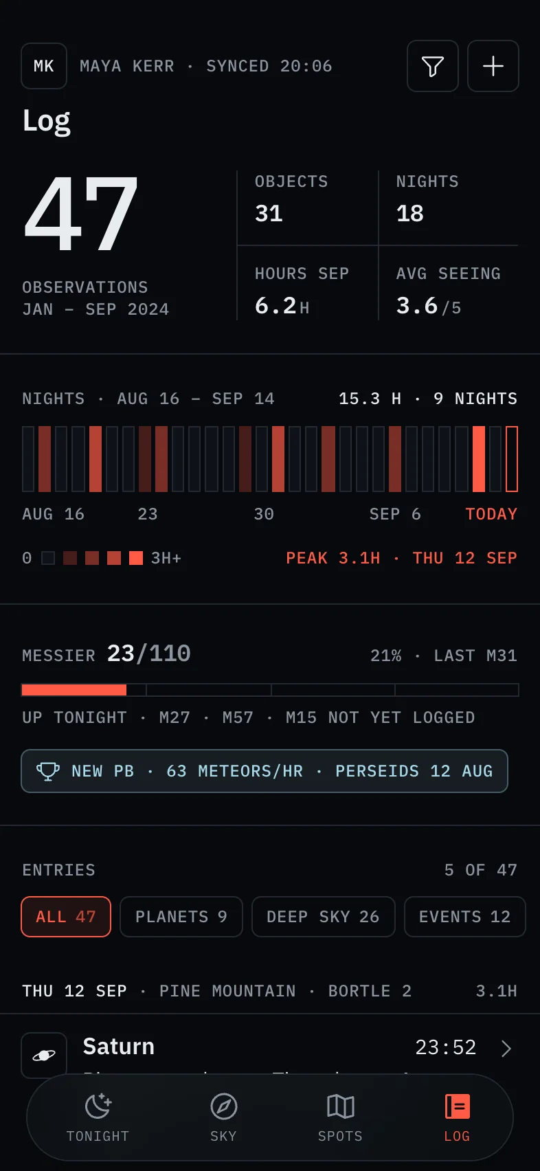
Three moments in one sentence: what's visible tonight, where to go, and a log to keep. Tappy turned “stargazing” into a night-safe instrument: dark, monospaced, with red used only for what's live.
Sprout & Sip, a plant care app
A plant care app that reminds you when to water each plant, tracks light and humidity, and diagnoses sick leaves from a photo. Draw every image with shapes and icons: no photos, and initials instead of faces.

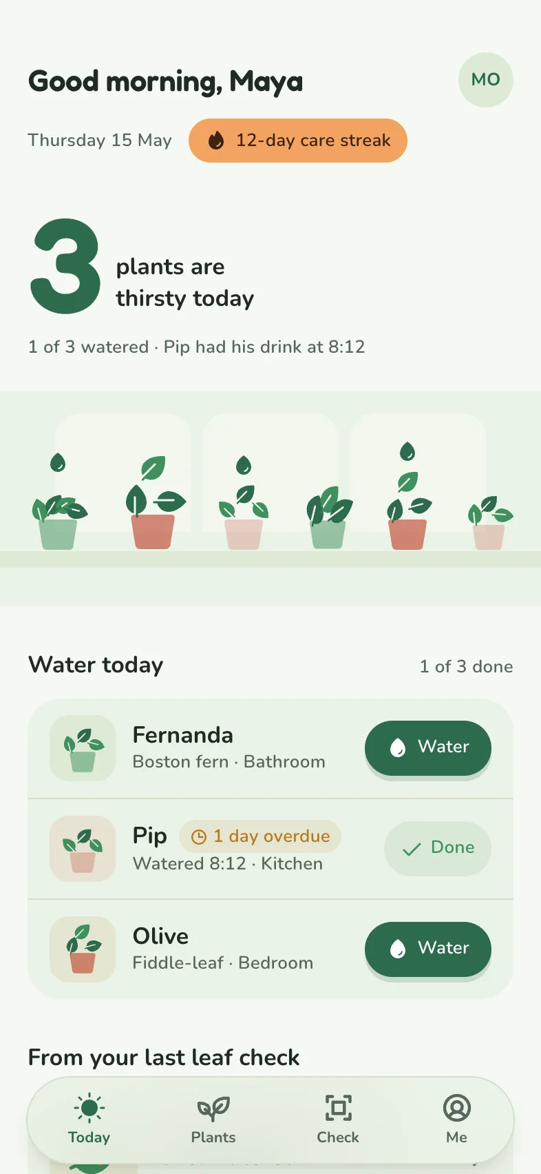
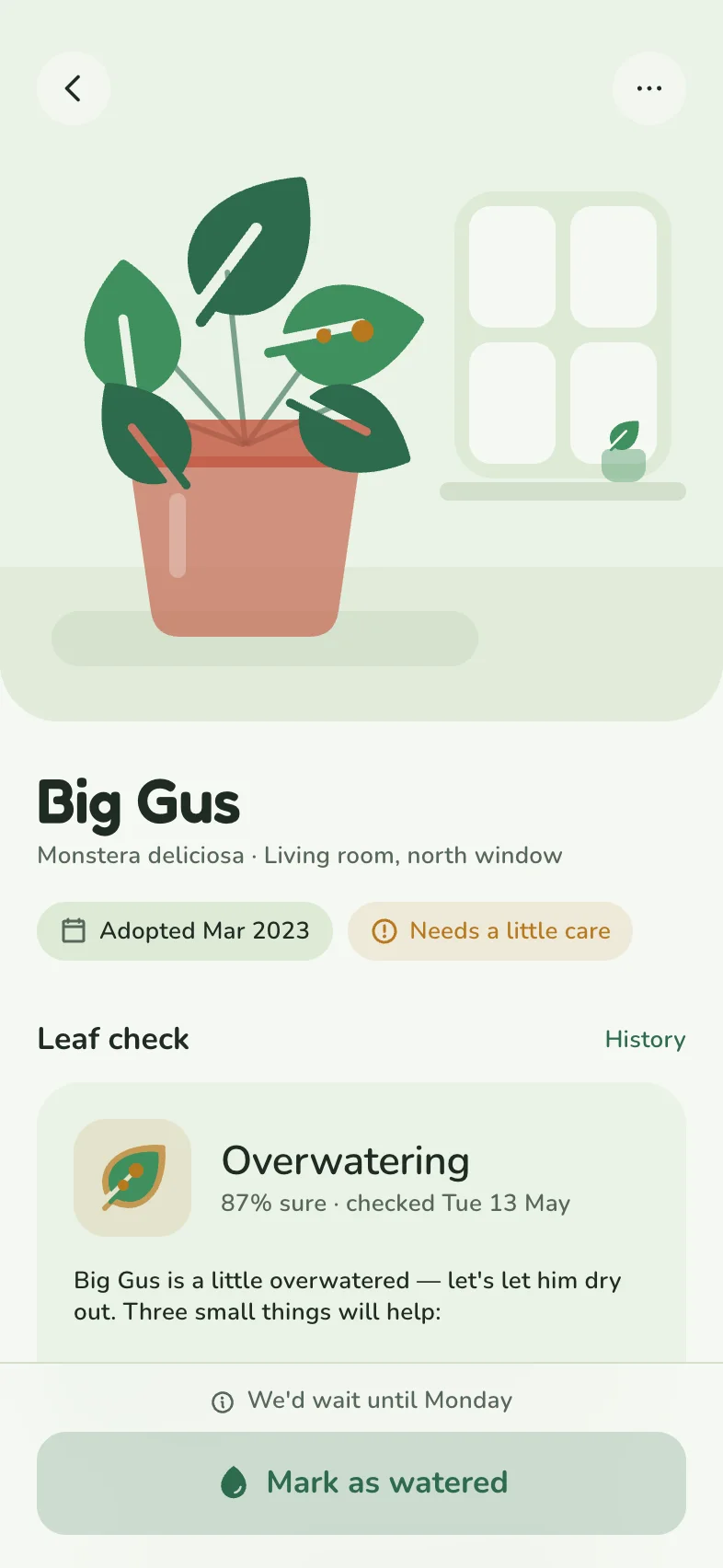
“Reminds you when to water each plant” became the whole point of the home screen: how many plants are thirsty today, with a button for each. The friendly tone came from the subject, without being asked for.
Crumb & Crust, a sourdough journal
A sourdough baker's journal with timers for each stage, starter health tracking, and an archive of bakes with notes. Draw every image with shapes and icons: no photos, and initials instead of faces.

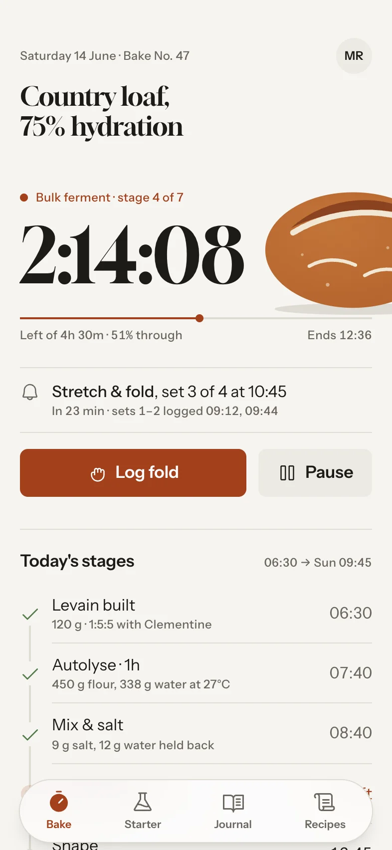
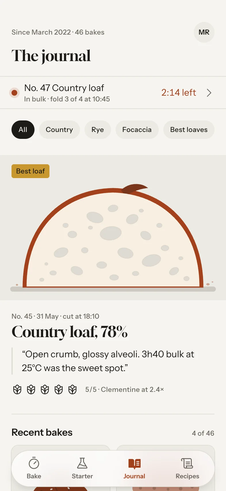
“Timers for each stage” made a live countdown the hero of the main screen. “An archive of bakes with notes” became a journal that reads like a cookbook.
Mistakes that make briefs worse
- A feature list instead of a job. Ten features with equal weight give you a screen where nothing leads.
- “Clean and modern”. Every app wants to be clean and modern, so it tells a designer nothing.
- Specifying every colour. Unless it's your brand, you're doing the designer's job without the designer's eye.
- Asking for every screen at once. Start with the three to five screens of the main journey. You can add more later in the same style.

Type a sentence. Tap your app.
Every screen designed, linked and ready to test.
Free to start. No card needed.
A template you can copy
Fill in the brackets, then paste it into the box on this page:
A [kind of app] for [who it's for] that helps them [the one job]. The most important moments are [moment one], [moment two] and [moment three]. It should feel like [a mood or a comparison]. [Any real constraints, like “no photos” or “use our brand green”.]
Short is fine. Darkline's brief was one sentence, plus the rule about photos.